Last Updated on April 10, 2026 by Click Raven
Organic traffic converts better than most channels. In 2025, ecommerce sites see average conversion rates between 2.1 percent and 3.4 percent, according to research by New Media. If your checkout underperforms, you are leaking high-intent revenue you already earned.
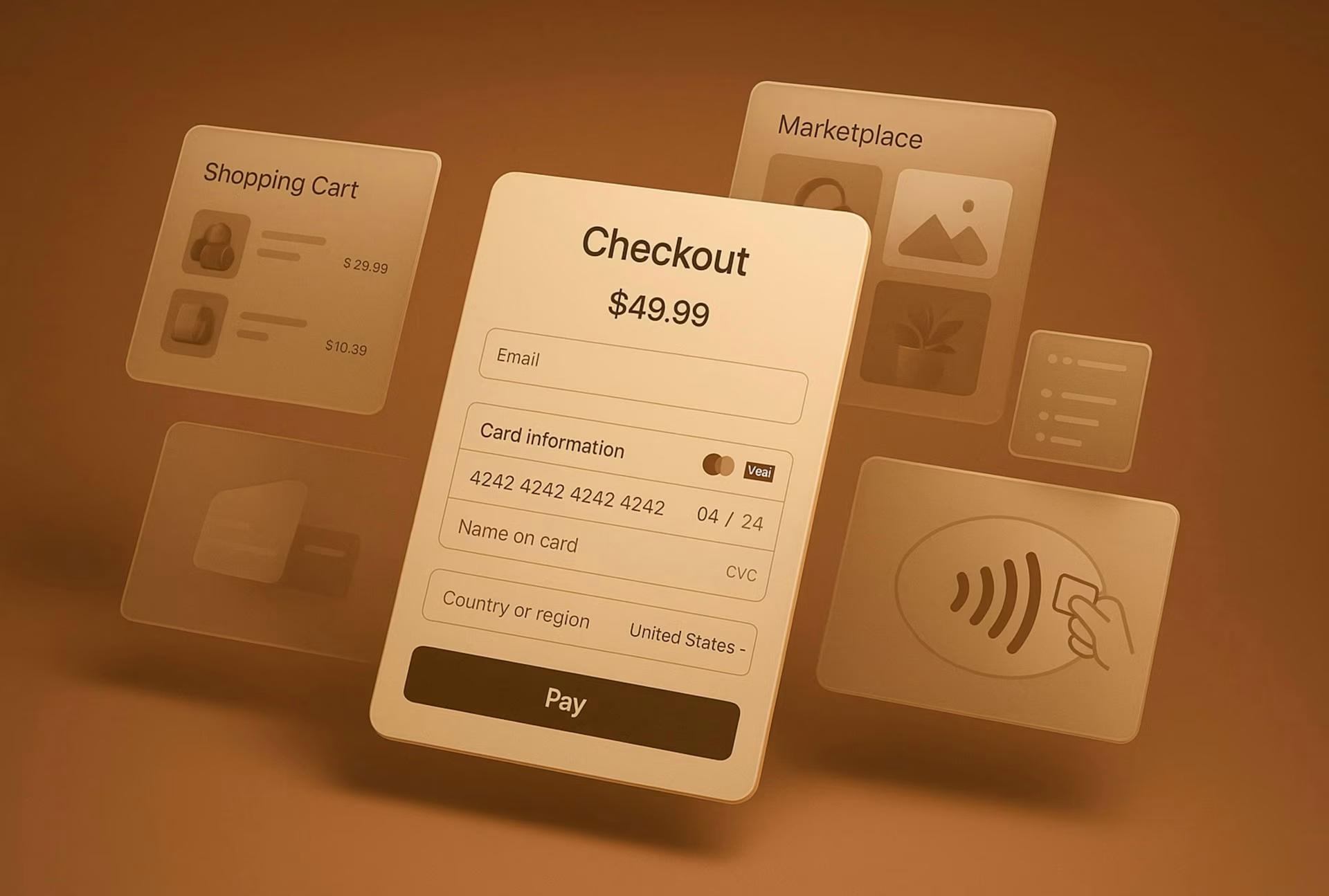
The good news is that checkout wins are measurable and fast. Here are 12 fixes that consistently lift conversion from organic visitors.
1. Speed Up Page Load Times
Organic visitors are often first-time buyers. They have intent, but not patience.
If your checkout takes more than a few seconds to load, friction compounds quickly. Compress scripts, defer non-essential tools, and audit third-party tags. Faster pages do not just feel better. They reduce abandonment at the exact moment revenue is on the line.
2. Remove Unnecessary Form Fields
Every extra field is a decision. Every decision adds friction.
Audit your checkout and remove anything not essential to fulfillment or compliance. Ask only for what you truly need. Shorter forms reduce cognitive load and increase completion rates, especially on mobile.
3. Offer Guest Checkout By Default
Forcing account creation is one of the fastest ways to lose organic buyers. Many are discovering you for the first time and are not ready for commitment.
Make guest checkout the default and offer account creation after purchase. You can still capture email, build loyalty, and follow up without blocking the sale.
4. Support Preferred Payment Methods
Digital wallets now account for a large share of ecommerce transactions, with projections showing continued growth according to Worldline. If your store does not support the methods customers expect, they hesitate.
That hesitation costs you. Add the payment options your audience already uses, including wallets, local methods, and region-specific cards.
5. Enable Tokenized One Click Pay
Returning organic visitors should not have to re-enter card details. Tokenized payments securely store credentials for faster repeat purchases.
Integrated systems like Planet make this easier by combining payment processing, token vaults, and cross-border capabilities in one platform. When checkout remembers customers safely across devices, friction drops and lifetime value rises.
6. Use Address Autocomplete
Typing full addresses on mobile is painful. Autocomplete reduces keystrokes and prevents formatting errors.
This small fix often shortens checkout time and lowers frustration. It also reduces failed deliveries caused by mistyped addresses.
7. Show Clear Taxes And Duties
Unexpected costs kill trust. Organic visitors compare options, and hidden fees push them back to search results.
Display taxes, shipping, and duties as early as possible. If you sell internationally, show accurate landed costs upfront. Transparency keeps momentum moving toward completion.
8. Localize Currency And Language
If you attract global organic traffic, do not force shoppers to calculate exchange rates in their heads. Local currency improves clarity and confidence.
Localized pricing paired with region-specific payment options creates a smoother path to purchase. Integrated payment platforms help manage this without stitching together multiple providers.
Checkout friction can drain revenue faster than slow traffic.
9. Add Trust Signals Where Decisions Happen
Trust badges buried in the footer do little. Place them near payment fields and call-to-action buttons.
Security icons, refund policies, and recognizable payment logos reassure buyers at the moment of hesitation. The goal is not clutter. It is confidence.
10. Design For Accessibility
Accessible checkout is not optional. Clear contrast, readable fonts, and logical tab order help everyone, including users on assistive devices.
Accessibility improvements also improve usability for mobile users and older shoppers. When checkout is easier to navigate, completion rates improve across segments.
11. Build Resilient Error States
Error messages should guide, not blame. Instead of vague warnings, explain exactly what needs fixing.
Preserve entered data when errors occur. Nothing frustrates users more than retyping information after a minor mistake.
Here are two simple principles to follow:
- Highlight the exact field that needs attention
- Use plain language to explain the issue
Clear recovery paths reduce abandonment caused by small hiccups.
12. Use GSC To Target High Potential Pages
Checkout fixes matter most when applied to the right traffic. Use Google Search Console to identify high-impression, high-click pages that under-convert.
These pages already attract qualified visitors. Improving their checkout flow multiplies the impact of your SEO efforts. Instead of chasing more traffic, convert more of what you have.
Turn Organic Traffic Into Real Revenue
Organic revenue is not just about rankings. It is about what happens after the click. These 12 checkout UX fixes align speed, clarity, trust, and payment flexibility with real buyer behavior.
If you want to turn more search traffic into completed orders, start by auditing your checkout against this list. For teams scaling globally, exploring integrated solutions like Planet can simplify payments, localization, and tokenization without adding complexity. If you are testing checkout changes on clickraven.com, share your results or reach out through your service page to compare notes with other growth-focused operators.